Thursday, December 3, 2009

CEFPI Presentation

Here are some resources for the session we held for the CEFPI conference in Anchorage today:

Websites

Children and Nature Network - www.childrenandnature.org

National Parks and Recreation Association - www.nrpa.org

Project for Public Places - www.pps.org

The Saguaro Seminar - www.hks.harvard.edu/saguaro/index.htm

Chugach Childrens’ Forest - http://www.alaskageographic.org/category/159/childrens-forest

Children’s Forest You Tube Channel (Chugach region youth-produced media) - http://www.youtube.com/user/ChugachChildForest#p/u/9/whLH8UzbE8U

Place-based and community-based education resources - http://www.promiseofplace.org/

Northwest Center for Sustainable Resources with guides for teachers on community-based education - http://www.ncsr.org/

Standards:

“Handbook for Public Playground Safety, Publication No. 325” U.S. Consumer Product Safety Commission, Washington, D.C. (free PDF link)

Books: (including link to possible purchase)

Design & Planning

2006, Tai, Lolly, “Designing Outdoor Environments for Children”, McGraw Hill, New York (purchase link)

2002, Kutska, Kenneth S. “Playground Safety is No Accident: Developing A Public Playground Safety and Maintenance Program” National Recreation & Park Association (purchase link)

1997. Moore, Robin, “Play for All Guidelines: Planning, Design and Management of Outdoor Play Settings for All Children”, MIG Communications, Berkeley (purchase link)

1978, City of New York, “A Playground for All Children”, City of New York, New York (purchase link)

1969, Dattner, Richard “Design for Play”, Van Nostrand Reinhardt, New York (purchase link)

Philosophy

2008, Louv, Richard, “Last Child in the Woods”, Algonquin Paperbacks, New York (purchase link)

Activities

1998. Cornell, Joseph, “Sharing Nature with Children”, Dawn Publications, Nevada City (purchase link)

2008. Ward, Jennifer, “I Love Dirt”, Trumpeter Books, Boston (purchase link)

1997, Chichester, Page, “Book of Family Nature Activities: 50 Simple Projects and Activities in the Natural World”, Owl Books, New York (purchase link)

Friday, November 13, 2009

Herman Leirer Road MultiModal Trail

Please go to this link for information on the project and our upcoming public meeting.

www.herman-leirer.blogspot.com

Saturday, August 8, 2009

Multiple Levels of Meaning

Through design, we try to create places with beauty and function, where people can be comfortable and have fun. Much of this is through simple "common sense" types of things like good stairs, making it accessible, providing seating, et cetera. One of the harder things is to get people to use your space. If there's a use or recreation resource built into it, then people will come specifically for that. A bigger challenge is how you make people fall in love with spaces? How do you set things up to have people invest their heart in something? This can be easy, or much harder... but the chances for this are greatly improved through events and community use. People love Kincaid for ski trails and recreational resources. Flat Top is a great hike. You probably know a great place downtown to sit and enjoy a bagged lunch. But, I also identify Peratrovich Park (4th and E) with the summer music scheduling they have. The parking lot at 3rd and E is really where the Saturday Market happens. These places begin to have a meta-identity that is beyond design, an identity that comes through use.
We went to Cuddy Family Midtown Park yesterday for their Summer Festival in the Park. A climbing wall, sand castles, print-making, motorized sailboats, music, food and a bunch of people. With the recent construction at the park, there's now a solid backbone for events. With the open-space, the plaza, the amphitheatre and all of the little spaces here and there, it provides a good venue for community events. I've been out there a few times recently, and it's getting used. In particular, people seem to be on the steps and ramp that lead to the water. Who doesn't love it when you can get down and touch the water? When a plaza invites you to do that? Yesterday, other than the programmed activities, people just seemed to be enjoying being in a park that allows (and encourages) unprogrammed enjoyment. The sunshine certainly didn't hurt...

I think I look forward to hearing about more and more events happening at Cuddy Family Midtown Park... I think that Anchorage may have found a place that provides our kind of 'Town Square'?

Wednesday, August 5, 2009

Youth Employment in Parks - Career Fair


i
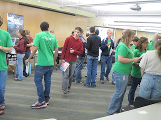
I went to represent for the American Society of Landscape Architects at the Youth Employment in Parks career fair. It was fun to chat with the teenagers and share what we do. It's hard not to be excited about the dream job I have. The fun part was engaging them in conversation. It's not too hard considering that all you have to do is ask them what they like to do, and it tends to be easy to relate it back to landscape architecture. That feels almost like a parlor trick. It just goes to show how broad our profession can be, and how it can appeal to a broad cross-section of interests and talents. It was fun to share what we do, and try to interest people in entering our profession!
~Peter

Tuesday, August 4, 2009

Youth Employment in Parks

We had two teenagers (Isaiah and Gaelan - left and right above, with Mike in the middle) in our office job shadowing Mike and I through Youth Employment in Parks, so we spent our morning showing them what we do typically (we're a landscape architecture firm). After taking them to Moose's Tooth, we drove around town a little bit looking at work that Alaskan landscape architects have done. It was enjoyable to share our profession with them, and we hope they had fun as well.

Below are some of the places that we visited, and while we did discuss them... any editorial below is my own.

Providence Regional Administration Building - Jon Petrunic and I did the design for this when I was still at Land Design North. We had fun with the opportunity to create a nice little plaza amenity for the users of the building, and it's turned out pretty well. It seems the crabapples didn't survive on this site, but it's great to see that either maintenance or people in the building have taken the initiative to plant perennials and annuals to warm it up and personalize it. (Land Design North and RIM Architects)

Spenard Skate Park - The equipment is a modular system from Skatewave. I'm a fan of skate parks and it's a well-used amenity in town. The skating part of it is pretty functional, but its setting is aesthetic with the combo wood & chainlink fence, and plantings and boulders at the entrance. (Parks & Recreation and ?)


Afognak Native Corporation Building - This is probably one of my favorite designed landscapes in Anchorage, definitely for an office building. It has a unity and a refined aesthetic that can be hard to achieve. It's a good balance of the natural with modern touches. Using native plantings and materials, and designed to keep stormwater on site (I assume), it's just a solid design on many levels. Kudos. I think this was the favorite for our YEP friends too. The lobby would be a great place to read on a rainy day. (KPB Architects I believe)

Habitat Housing in Midtown - Habitat does good things. I'm especially a fan of their used building materials at their ReStore. This residential development is pretty well squeezed onto the site, but it does have a bioswale/raingarden out front, a landscaped common area to one end, and courtyards that use unit pavers, giving them a warm feeling. I believe the pavers are heated to reduce winter maintenance, and they're also a porous paving system to allow stormwater to go down. Tamas Deak volunteered for the site design aspects I think.


Cuddy Midtown Park - This park continues to develop into a gem. As the landscape matures, it will continue to develop character and fulfill its potential. I believe there are other things that will be developed here to achieve the park's master plan? The place really seems to shine for events. Another place liked by our YEP mentorees. (Land Design North and a host of community involvement)
~Peter

Piper Street


If we set some of the benchmarks for good gateway/streetscape design as being of a style and scale that matches the area, then unfortunately the Piper Street work scores lower on the charts. The elements just seem to sit heavily within this short corridor, and lack an overall cohesive unity. Other gateways seem to have something to say, or add to the character of a neighborhood... but these ones seem to merely mumble a bit. The concrete walls create too much division, and seem to overly 'defend the pedestrians'. The sign (in very small text difficult to read by people in cars) announces this as being the 'UMed Gateway Neighborhood'. Is the neighborhood relegated to having its road be a gateway to somewhere else? The metals structures suffer from a lack of hierarchy, in that everything seems kind of the same (color & material sizing especially). Without a dominant element, they lack scale and unity. I think an immediate big improvement might be to enlarge the logo and better identify what these are (including larger text)... but I can't help but feeling being labeled the "UMed Gateway Neighborhood" is defining this neighborhood as a place that is on the way to another place. That wouldn't give me a warm and fuzzy neighborhood feeling... thoughts? Please comment...

Location: Piper Street north of Tudor
Designer: DOWL/HKM

Sunday, May 24, 2009

The Vogue of Branding

Whether trying to create 'districts' downtown (SONO - South of Nordstroms... sigh), or superimposing character on a neighborhood, is there a current vogue for naming things? The idea of 'branding' a few blocks of downtown seems a bit much like hoping that if they name it, it will come to fruition. I think in other places, there's a bit more of an organic development for such things. They gather momentum and a name happens when it should.

Gateways seem to be happening with road projects in Anchorage. So, whether a neighborhood is ready for it or not, there's an opportunity within funding to get one. As designers, we love to design things, so I think there's a temptation to try to develop something great for the neighborhood. It's not one percent for art, it's more 'graphic design for the landscape'. It's hard to be on a project and say, "this isn't the right place for one". That's why I'm curious as to whether we can develop criteria that could be used. This could be a fruitless or unnecessary task, but an interesting one (see collaboration link on left for Gateway Criteria). I think one of the issues is a funding one... with road projects, the capital funding is there... so, the urge is to use it. There likely won't be another pot of money for it again in the future...

When does good design go beyond reinforcing what's there (aesthetic planting & streetscape design) to upping the ante and branding things (gateway)?

Then, what's the definition of gateway? I'm using it as a larger iconic feature so far, but that's only one end of the gateway spectrum... really, a gateway can take many forms. So, perhaps I should be calling these objects "gateway features"... and they are incorporated into an overall gateway.

~peter

Fan Box

Corvus Design on Facebook